The Daily Art Logs
Notes from a daily creative practice.
🎨 Finding My Color Voice in Oils: Between Triads, Fauvism, and the Rainbow Method
Lately, I’ve found myself circling back — again and again — to the question of color palette. More specifically, whether I should commit to a limited palette for mastery and harmony, or curate a broader collection of convenience colors that bring me joy 🌈. This has become especially pressing as I step deeper into the world of oil painting, where the stakes (and the textures) feel more permanent than in watercolor or gouache.
I’ve heard from both camps: some artists rave about the simplicity of limitations, while others freely dip into a kaleidoscope of color and produce work I deeply admire. So why do I keep coming back to this?
I think I’m searching for a sense of resolution — for a personal palette that feels like mine, that can act as a foundation, a comfort zone, a launchpad. A palette I trust. 🧭
🧪 Experimenting With Triads in Oils
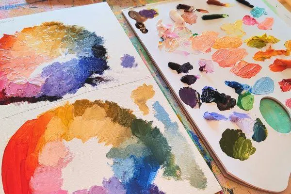
Recently, I tested two different triads to see how they felt in oil. These were not random combinations — they were rooted in color theory but chosen for expressive potential.
🎯 Triad 1:
French Yellow Deep (Charvin) – a warm, almost orange-leaning yellow
Ultramarine Blue
Quinacridone Rose (Van Gogh)
✅ Results:
Beautiful, luminous purples
Warm, radiant oranges and reds
Muted greens — more subdued than expected due to the yellow’s warmth
Despite the subdued greens, I found them attractive. This would be an ideal palette for expressive sketching or painterly landscapes — emotive and cohesive.

🎯 Triad 2:
French Yellow Deep
Cerulean Blue
Quinacridone Rose
✅ Results:
Greens were more luminous and slightly cooler
Turquoises had a beautiful, moody life to them
Still no garish hues, which I often struggle with
🩷 Quinacridone Rose stayed in both palettes — it’s non-negotiable for me. It gives me the violets and pinks I love and is central to my emotional range.

🤔 What’s Still Missing?
Even after those tests, I felt something was unresolved. Not in the pigments, but in how I was placing and distributing them. As I studied one of my paintings, I saw green in two places, purple in several — and it didn’t sit right.
That’s when it clicked: I had let go of my inner color structure — something I usually follow through what I call the Rainbow Method. A way of flowing color logically and emotionally across a form or composition. I’d stepped into realism, and abandoned my voice.
🌈 The Rainbow Method Meets Oils (with a Fauvist Heart)
Fauvist painters — Matisse, Derain, Vlaminck — used color not to describe reality, but to convey feeling, light, movement. Their work is bright and saturated, yet never garish. Why?
🧠 Their Secrets:
🎯 Limited color families used confidently
🎨 Saturation balanced by muted or neutral areas
🔲 Strong value and shape design beneath the color
💫 Intentional color echo and repetition
🖌️ How I Applied This to a Landscape Painting
A recent subject: a landscape with a meadow, cherry trees, a little house, and a sky. I wanted to apply the rainbow method and Fauvist color logic at once.
Color Flow Plan:
Foreground (Meadow): warm greens, golden yellow grasses 🌾
Cherry Trees: pink blossoms (Quin Rose) fading as they recede 🌸
House: neutrals and warm shadows — maybe some rose reflected from the trees 🏡
Trees Behind House: shifting into cool blue-greens or blue-violets 🌲
Sky: lavender near the horizon, cobalt or turquoise above ☁️
This let me create emotional movement through hue, not just through value.
🎨 My Fauvist-Inspired Oil Palette
🔥 Core Vibrants:
Cadmium Yellow Deep
Cadmium Red Light
Quinacridone Rose 💖
Ultramarine Blue
Cobalt Teal or Cerulean Blue
Phthalo Green (Blue Shade) — used carefully
🌻 Harmonizing Earths & Neutrals:
Transparent Red Oxide
Raw Umber
Titanium White
Violet Grey (Ultramarine + Burnt Sienna)
Muted Blue-Violet
I use the earths and neutrals to balance the brights, giving them space to shine without overloading the eye.

🧘♀️ A Personal Color Ritual Emerges
This process has helped me shape a new way of working:
Start with a triad or small group to create a cohesive base 🎯
Apply the rainbow method to flow color through space or emotion 🌈
Add convenience colors only at the end for sparkle ✨
Echo colors throughout to unify the painting 🔁
🌸 Still Searching — But Closer Than Ever
I’m not sure I’ll ever “arrive” at the one true palette. But I’m no longer searching aimlessly. I’m beginning to build a system — not of limitation, but of intentionality. A way to let my color instincts and emotional language speak clearly, especially in oils.
And maybe that’s the real answer:
Not to find the perfect palette,
but to build one that listens to you as much as you listen to it.
I'd love to hear from you! You can find my on social media or email me-
All rights reserved | Privacy Policy | Terms & conditions


