The Daily Art Logs
Notes from a daily creative practice.
Stealing Like a Fauve: Lessons from Vlaminck’s Bougival 🎨🌈
As part of my journey embracing the idea of "stealing like an artist," I decided to start by learning from the Fauves — and who better than Maurice de Vlaminck, whose wild, unapologetic color feels like home to me.
The piece I chose is Bougival (1905), a landscape that immediately pulled me in. It's not just colorful; it's color in motion, color that sings. 🎶 What struck me first was how the hues unfold almost like a rainbow — blues, greens, yellows, and reds cascading across the canvas in a vibrant, intuitive order.
This "rainbow method" of color — moving through the color wheel in a loose, expressive sequence — is something I naturally do in my own work, often without even realizing it. Seeing it here, in the hands of a Fauve, felt like a mirror held up to my instincts. It made me realize how much permission there is in taking liberties with reality: Vlaminck's Bougival likely looked nothing like this in life, but in paint, it becomes something bigger — a landscape of feeling. ✨

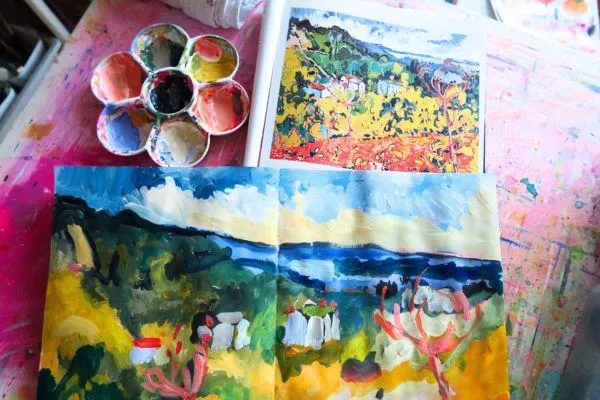
Above: Bougival, 1905 by Maurice De Vlaminck
My Process 🖌️
To dive into Vlaminck’s world, I recreated Bougival using acrylics in my sketchbook. Instead of aiming for a polished piece, I treated it like a study — a true exploration.
I worked from top to bottom, moving my way through both the painting and the color spectrum. I started with the sky’s soft blues, transitioned into the deep greens of the hills, then the brilliant yellows of the trees, and finally landed in the fiery reds of the foreground. 🔥
This process felt natural but also new: in the past, I’ve experimented with colorful landscapes, but I’ve always held back from fully imposing my "rainbow method" onto a scene. This time, I let go and made the landscape fit the color story I wanted to tell — just like Vlaminck must have done.
Note to self 📸: next time, take process photos! I got completely absorbed in the painting and forgot — but honestly, being that deep in the moment felt like its own little success.

What I Learned ✍️
Painting from top to bottom really clicked with my brain — it made the project feel like a series of small, manageable wins rather than one overwhelming scene. In future original pieces, I’ll probably sketch lightly first, just to anchor the composition a bit better before diving in.
Color matching proved to be an interesting challenge. Right now, I have lemon yellow (which sometimes feels too weak) and Sahara Yellow from Flashe (which leans very orangey). Between the two, hitting that perfect, powerful yellow was tricky. This exercise made it clear: I probably need to add a cadmium yellow hue to my palette. 🎨
Another observation: Vlaminck’s original painting is full of tiny, energetic brush strokes. I chose not to get bogged down copying every detail — this was about learning the spirit of the piece, not creating an exact replica.

Medium Matters and Color Musings 🎨🖌️
One limitation I ran into was my choice of medium. I used fluid acrylics, which are intentionally not heavy-bodied, so I couldn’t quite replicate the thick, juicy brushwork of Vlaminck’s oils. If I were aiming for that richness of texture, oils would be the better choice.
I also loved how Vlaminck painted the trees — fiery red shapes that guide the eye through the entire composition, even reaching into the cooler blue zones. His balance of warm and cool colors is masterful and something I definitely want to borrow for my own work.
On a related note, I remembered something from the world of color analysis (the kind used in fashion to "season" people based on their tones). I once heard someone say that turquoise acts almost like a "temperature-neutral" — complementing both warm and cool palettes. Thinking about it, Vlaminck’s piece uses that concept beautifully: about two-thirds warm tones, bridged by turquoise and cool blues that bring everything into harmony. 💙

Final Thoughts: Finding My People Among the Fauves 🌟
Overall, this was an incredibly energizing and affirming experience. Diving into the world of the Fauves feels like finding my people — and Vlaminck’s color instincts in Bougival feel so much like my own.
This study also made me reflect on my use of neons. Immersing myself in this period made me realize that while neon can be fun, it often overwhelms the kind of rich, natural balance I want. Here, even with all the saturated colors, there’s a harmony that neon sometimes disrupts. I’m not saying goodbye to neon forever, but for now, I’m excited to explore this richer, more natural palette.
One big surprise: how much I loved the reds I achieved! Vermilion Hue from Flashe, which often looks sad next to neon, looked beautiful when surrounded by other deep, saturated tones. ❤️
This whole exercise left me feeling energized, excited, and ready to continue stealing from the Fauves — learning, adapting, and making their bold, colorful spirit part of my own artistic voice.
Color is my compass, and every painting is an adventure. Thanks for wandering with me today! 🚀🎨

I'd love to hear from you! You can find my on social media or email me-
All rights reserved | Privacy Policy | Terms & conditions


