
The Daily Art Logs
Notes from a daily creative practice.
Bright Beginnings: Exploring My Yellows and finding Better Greens 🎨✨
Lately, I’ve been on a mission: to truly understand the yellows on my acrylic palette and to finally solve my ongoing struggle with mixing beautiful, reliable greens. 🌿
Rather than rush out to buy new paints, I decided to start by exploring what I already had on hand — and what I learned has been incredibly rewarding.

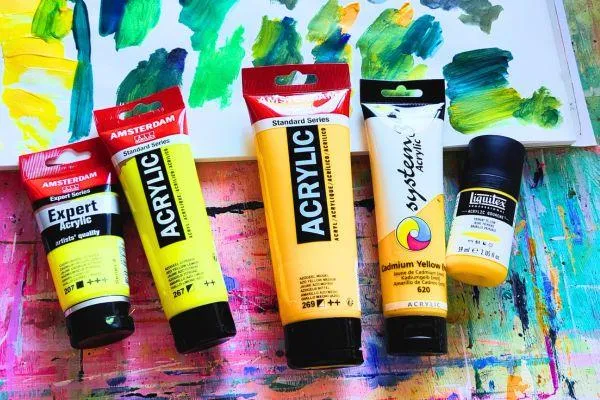
The Yellows I Explored 🌞
Here’s what I pulled from my paint box:
Amsterdam Azo Yellow Lemon 267 – a bright, cool lemon yellow.
Amsterdam Expert Cadmium Yellow Lemon 207 – a rich, opaque lemon.
Liquitex Matte Primary Yellow – a lovely balanced yellow, but sadly a bit too rare and expensive for me (I'm in Austria).
Amsterdam Azo Yellow Medium – a warmer, orangier yellow.
Daler Rowney System 3 Cadmium Yellow 620 – a warm, sunny yellow.

First Impressions 🌟
In pure form, I naturally gravitated toward the warmer yellows. They felt richer and more intuitive to me.
When white was added, even the cool lemon yellows became appealing — unlocking a delicate, light-filled yellow I can't achieve with warm yellows alone.
I realized that while I love warm yellows for everyday painting, lemon yellows have a special role when creating light, impressionistic effects.

Quick Dive Into Art History 📜🎨
🖼️ Did You Know?
In the 19th century, artists finally got access to brighter, more stable yellows like lemon yellow and cadmium yellow — pigments that completely changed how they painted light.
The Impressionists used cool lemon yellows for sparkling sunlight and vibrant greens, while warm cadmium yellows created rich, golden highlights.
Later, the Fauvists pushed yellows even further, using them boldly and purely to energize their compositions.
Today, thanks to advances like azo yellows, artists enjoy even more vibrant, durable options for capturing the glow of life on canvas!
Mixing and Matching: The Real Testing Begins 🧪
Armed with my blues — Ultramarine Blue, Prussian Blue, Indigo, and Viridian — I started systematically mixing each yellow to see what greens I could create.
Here’s what I found:
💛 System 3 Cadmium Yellow 620
Gorgeous with white — made creamy, warm tints.
Lovely olive greens when mixed with Indigo.
Deeper bluer greens when paired with Ultramarine.
Brighter greens when mixed with Prussian — deep forest tones.
✅ Verdict: Super versatile! A very strong candidate for my main everyday yellow.

💛 Amsterdam Azo Yellow Medium
Very similar to System 3 but even more orangey.
Pretty on its own, but maybe a bit too warm for maximum green versatility.
✅ Verdict: Nice to have but not essential if I already have System 3.
💛 Liquitex Matte Primary Yellow
Beautiful color balance!
But too expensive and rare to justify as a staple.
✅ Verdict: Appreciate it while it lasts, but not building my palette around it.

💛 Lemon Yellows (Azo Lemon + Cad Lemon)
Amazing with white — crucial for creating light-filled yellows.
For greens, only really loved when mixed with Indigo or Black — made beautiful, complex olive tones.
Not my go-to for lively greens — but critical for versatility when trying to match master palettes (especially Impressionist and Fauvist effects).
✅ Verdict: Important specialty color — not everyday, but essential for certain lighting and palette matching.

Organizing My Personal Green Pathways 🌿
To help myself remember the mixes I loved, I created a simple Greens Map:
Mix Mood
Use System 3 Cad Yellow 620 + Indigo Olive green – earthy, subtle
System 3 Cad Yellow 620 + Prussian Blue Bright forest green – fresh but deep
System 3 Cad Yellow 620 + Ultramarine Blue Misty natural green – bluer and softer
Amsterdam Azo Lemon + Indigo Pale olive – delicate foliage or Fauvist touch
✅ Instead of memorizing exact "recipes," I'm thinking in green families now — matching color mixes to the mood I want to create!
Final Thoughts 💭
Exploring my own paints before buying new ones taught me so much about what I truly want from my palette.
I now see that both warm and cool yellows have their place — warm yellows for day-to-day vibrancy, and cool lemon yellows for those magical light effects.
If you’re struggling with your greens (or any color mixes), I highly recommend taking a deep dive into your current paints. 🌟
You might be surprised by what’s already waiting for you!
🎨 What's your favorite yellow or green mix? I'd love to hear about it! 🌿

I'd love to hear from you! You can find my on social media or email me-
All rights reserved | Privacy Policy | Terms & conditions


