🎨 A Garden Palette Experiment: Setting Up a Simple Acrylic Color Study Kit (No Neon Pink!)
Lately, I’ve been feeling the need to strip things down — not to limit myself creatively, but to see what happens when I remove the extras and go back to something foundational.
This week, I built a simple acrylic palette using only the affordable paints I already had on hand, skipping my beloved neons (💔 no neon pink in sight!) to explore whether a classical limited palette could actually fit my creative process — especially in settings like plein air painting in the garden 🌿
🧪 The Goal
To create a portable, versatile, expressive color study palette for acrylics — something I could take outside, that’s simple, harmonious, and grounded in the principles of color mixing and emotional balance. Basically: a little Fauvism, a little discipline, and a lot of curiosity.

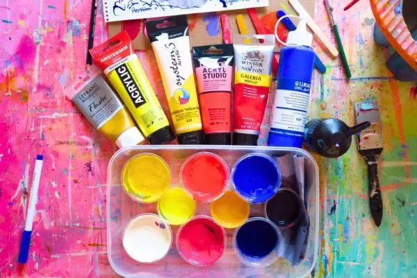
🖌️ The Colors I Used
I didn’t go for fancy brands or rare pigments.
I used what I had — easily available, student-grade acrylics that are affordable and practical:
Role Paint & Brand
🟡 Warm Yellow System3 – Cadmium Yellow Hue
🟡 Cool Yellow Amsterdam – Azo Lemon Yellow
🔴 Warm Red Boesner – Zinnoberrot (Vermilion Hue)
🔴 Cool Red / Pink W&N Galeria – Permanent Rose
🔵 Warm Blue Lukas Cryl – Ultramarine Blue
🔵 Cool Blue Aquarylic Cyan – Phthalo Blue
⚫ Custom Dark Mixed: Cyan + Permanent Rose + touch of Primary Yellow = a beautiful deep grey-black 🖤
🖤 Mixing My Own Black (and Loving It)
Rather than using a tube black, I mixed a chromatic dark using:
💙 Cyan (Phthalo Blue)
❤️ Red (Vermillion Hue)
💛 A touch of Primary Yellow
It gave me a rich grey-black — not flat or harsh — that blends beautifully into shadows and muted tones. This mix keeps the harmony within the palette and avoids that “dead weight” that tube blacks sometimes bring to acrylics.
🌿 Why This Palette?
I wanted something:
Lightweight & practical for painting outside ☀️
Affordable and based on what I already own 💸
Color-theory friendly, letting me mix a wide range from a few pigments 🎨
Emotionally expressive, even without my usual neon punch 💖
And maybe most importantly:
👉 I wanted to see what’s essential to my creative process — and what’s just habit.
🧠 What I’m Noticing So Far
I do miss my high-chroma neons — but it’s freeing to focus on value and temperature again.
The custom black mix gives me control and subtlety I hadn’t expected.
Having just a few colors makes every mix feel intentional, not impulsive.
It’s helping me reconnect with my color instincts rather than relying on favorite tubes.

🧺 Ready for the Garden
This palette is now ready to hit the garden with me. I’ll be using it for color studies, sketches, and testing how it holds up under natural light and time pressure — without the comfort of fluorescent pinks or specialty shades. 🌸🌳🖼️
📌 Takeaway: Limitations Spark Insight
This whole setup is an experiment — not a rejection of the tools I love, but a way to ask:
What do I really need to express myself?
So far, the answer seems to be:
A few good colors, a quiet space, and time to explore. 💛
